 22 Terms
Home > Terms > Filipino (TL) > logo ng Gap
logo ng Gap
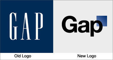
Gap has used the same logo for over 20 years, instantly recognizable with its stretched, white letters against a navy blue background. Yet the company recently released a new logo, created in collaboration with the customer community, to widespread indignation. It has been called a “Microsoft Word” creation and a “prototypical brand panic move”. Gap is already rethinking the change.
0
0
Improve it
- Part of Speech: noun
- Synonym(s):
- Blossary:
- Industry/Domain: Apparel
- Category: Coats & jackets
- Company: Gap
- Product:
- Acronym-Abbreviation:
Other Languages:
Member comments
Terms in the News
Featured Terms
Industry/Domain: Fruits & vegetables Category: Fruits
saging
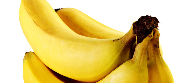
The world's most popular fruit. The most common U.S. variety is the yellow Cavendish. They are picked green and develop better flavor when ripened off ...
Contributor
Featured blossaries
rufaro9102
0
Terms
41
Blossaries
4
Followers
20 types of friends every woman has
Category: Entertainment 5 22 Terms
22 Terms
HOSEOKNAM
0
Terms
42
Blossaries
11
Followers
International Political Economy
Category: Politics 1 13 Terms
13 Terms
Browers Terms By Category
- Contracts(640)
- Home improvement(270)
- Mortgage(171)
- Residential(37)
- Corporate(35)
- Commercial(31)
Real estate(1184) Terms
- Hats & caps(21)
- Scarves(8)
- Gloves & mittens(8)
- Hair accessories(6)
Fashion accessories(43) Terms
- General astronomy(781)
- Astronaut(371)
- Planetary science(355)
- Moon(121)
- Comets(101)
- Mars(69)
Astronomy(1901) Terms
- Industrial lubricants(657)
- Cranes(413)
- Laser equipment(243)
- Conveyors(185)
- Lathe(62)
- Welding equipment(52)
Industrial machinery(1734) Terms
- Air conditioners(327)
- Water heaters(114)
- Washing machines & dryers(69)
- Vacuum cleaners(64)
- Coffee makers(41)
- Cooking appliances(5)